The Evolution of Responsive Design
Modern AI solutions dynamically adapt interfaces based on user interaction patterns and iterate them by evaluating device capabilities and contextual data. The AI evaluates how users interact with different elements and automatically adjusts layouts, content hierarchies, and interactive components to get responsive designs. For example, if AI detects that mobile users frequently utilize specific features, it can prioritize those elements in the mobile interface by dynamically evaluating the type of user. This data-driven approach ensures that responsiveness serves an actual seamless user experience rather than following rigid rules. This article will explore what we have available now and the future of AI-driven responsive UI/UX design.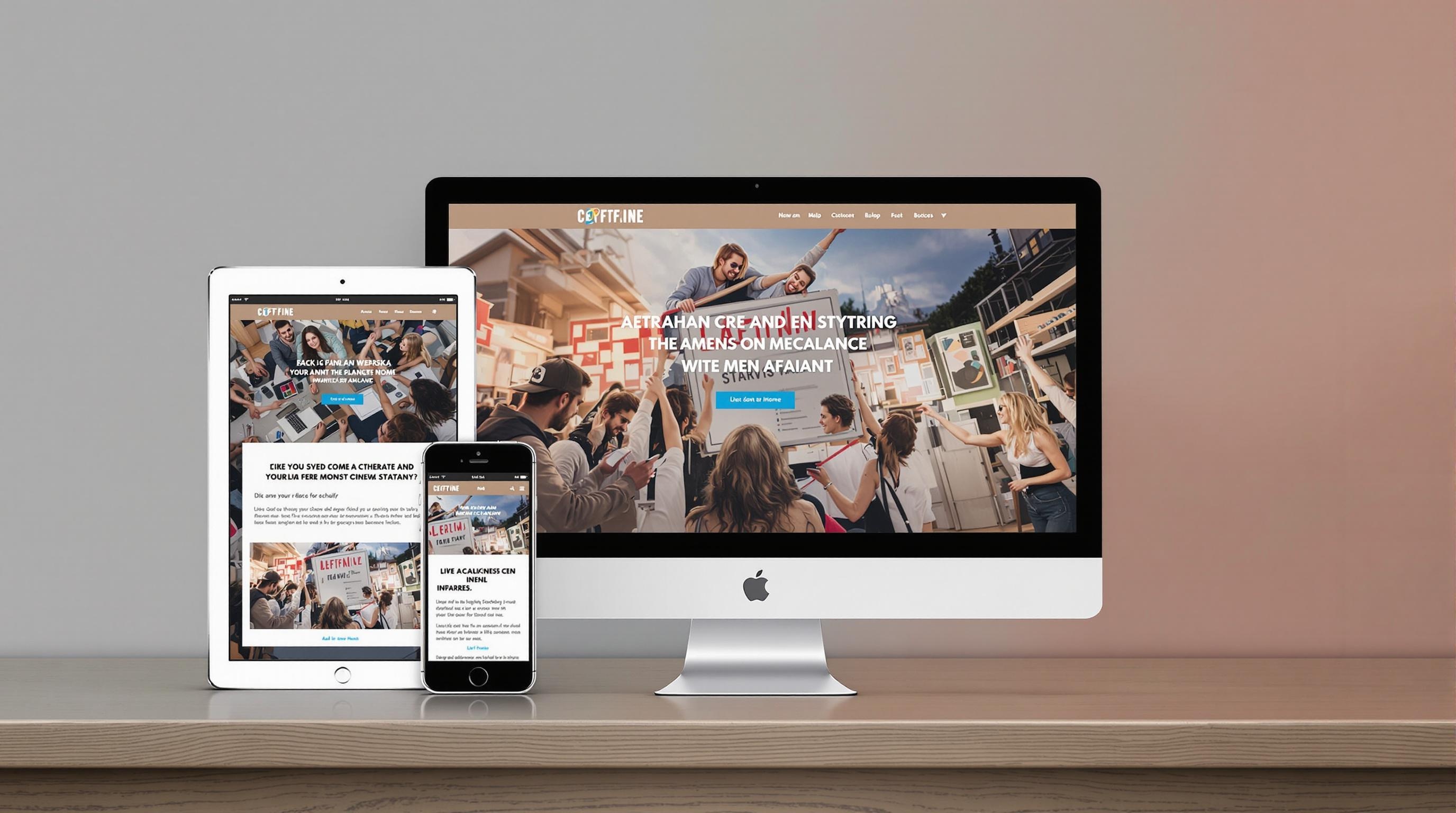
Core Components of Responsive Design
Consistent, user-friendly experiences across all devices are only possible with the working harmony of core components of responsive design. These are:-
Fluid grids & layouts
- Layouts that dynamically adapt to different screen sizes using relative units rather than fixed pixels
- Content automatically adjusts and reflows based on viewport dimensions
-
Flexible images
- Visual assets that scale proportionally
- Proper resizing without losing quality
-
Small-screen first approaches
- Mobile-first design approaches
- Ensure core content and functionality work on all devices
-
Prioritization of the Content
- Changing content display and hiding based on screen and device
- Content hierarchy across different viewport sizes
-
Navigation systems
- Adaptable navigation patterns (hamburger component for mobile, sidebar component for web)
-
Performance
- Fast loading across all devices and network conditions
- Efficient delivery of resources based on device capabilities
How Does AI Handle This?
So, how does AI handle web design smarter? It all begins with one of the crucial design principles — adaptability. AI intelligently adapts the content based on screen size and user preferences. It continuously learns from user interactions and improves how a website responds to different screens and usage patterns in real-time.Example of AI UI design in Responsiveness
AI-driven design models don’t only adapt the layout; they change how the content of the page is displayed. This is an important improvement — it sometimes chooses the relevant images for a particular size, adjusts the font size, and suggests various design tweaks to create a better user interface. When we collect them together, AI can handle responsiveness by:- Evaluating user interface for usability, analyzing patterns and user interactions, and providing automated testing
- Adapting content based on user behaviors and preferences and creating customized experiences while maintaining consistency
How Does Polymet Utilize AI in Responsive Design?
Responsive UX design is possible by preparing the core components to behave responsively to different needs. Polymet provides fluid layouts and grids that can be adaptable to different screen sizes. Also, we’re getting the project context and using FLUX models to create relevant images for the given project and resize the images according to layout needs. The key benefit is that each generated page and design has responsive behavior. So, one of the critical traditional design problems is solved by using AI.
The Key Benefits of AI-Enhanced Responsive Design
- Personalized user experiences — The AI analyzes individual user preferences and behaviors to deliver customized layouts and interfaces. This level of personalization helps create more engaging and efficient user experiences across devices.
- Automated Optimization — AI streamlines the design process by automatically generating and testing responsive variants. This reduces development time while ensuring consistent quality across breakpoints. The system can identify potential issues before they impact users.
- Real-time adaptation — AI enables interfaces to evolve based on actual usage patterns rather than static breakpoints. The design responds to screen sizes and how users interact with the interface on different devices.