Documentation Index
Fetch the complete documentation index at: https://docs.polymet.ai/llms.txt
Use this file to discover all available pages before exploring further.
Essential UI Patterns and How Polymet Makes Them Effortless
Have you ever stared at a fresh blank canvas, with no idea? Its a natural starting point. That’s what motivated people to explore UI patterns: they’re tried-and-true design solutions that ensure users feel right at home on a website or mobile app. Today, we’ll walk through five core patterns, highlight best practices, and share how Polymet can bring these designs to life with couple of prompts.What is User Interface?
User interface (frequently UI) is the collection of visual elements inside the product page, you can think buttons, screens, and forms that guide people through a digital experience. It’s the key to turning fascinating ideas into practical, easy-to-use products, highlighting the crucial connection between a system’s capabilities and the user’s needs.
What are the UI patterns?
UI patterns are repeatable frameworks or solutions to everyday design challenges. They help teams maintain consistency, speed up development, and design experiences that users instantly recognize. From navigation bars to login forms, these patterns reduce guesswork and free designers to focus on bigger-picture goals, like storytelling or brand identity.
What Is User Interface Design?
In the meantime, user interface design is the art of shaping how an app or website looks, feels, and flows. It combines visual design, interaction design, and simplicity to craft experiences people enjoy. By focusing on clarity and familiarity, UI design removes friction and helps users reach their goals effortlessly. There are so many different UI patterns that designers should know, this article includes 5 common UI patterns that we’re encountering so many times.1. Forgiving Format
Imagine you’re on “FlightNow,” searching for flights. You enter your travel dates as “12-15-2023” instead of “12/15/2023,” and the form auto-corrects it. That’s a forgiving format in action—no annoying errors, just an intuitive fix. People hate feeling scolded, so forgiveness fosters trust. Pro Tip: Validate user input on the fly. Instant feedback goes a long way toward eliminating frustration.
2. Breadcrumbs
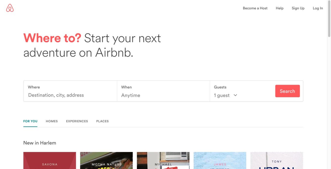
Browsing products on “Buy Now,” you might see a small trail of links at the top: Home › Electronics › Smartphones. These breadcrumbs reassure you about your current location and the path you took to get there. Simple, clear, and essential for complex site structures. Pro Tip: Keep labels short and relevant. Avoid clutter that overwhelms the user.
3. Subscription Plans
Netflix is a great example of subscription-based UI patterns. With clearly outlined tiers—Basic, Standard, Premium—users can pick what level best fits their budget. Plus, Netflix highlights the most popular choice, making selection even easier. Pro Tip: Always display plan differences in plain, straightforward language. Don’t hide the details or people will bail.
4. Leaderboard
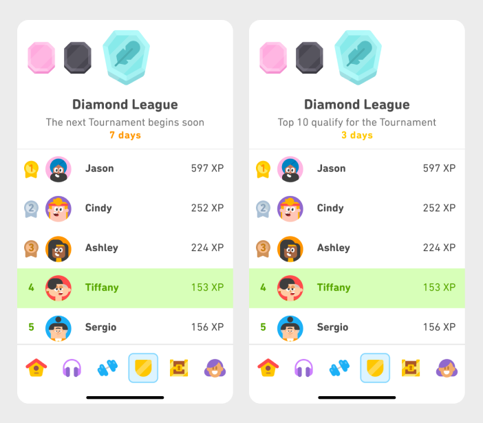
Think of “FitRank,” an app tracking your daily steps versus friends. The leaderboard pattern rewards users through gamification. It fosters friendly competition and keeps people engaged. Pro Tip: Ensure clarity in how ranks are calculated. If the user’s rank appears ambiguous, the leaderboard loses credibility—and the app loses users.
5. Dark Patterns
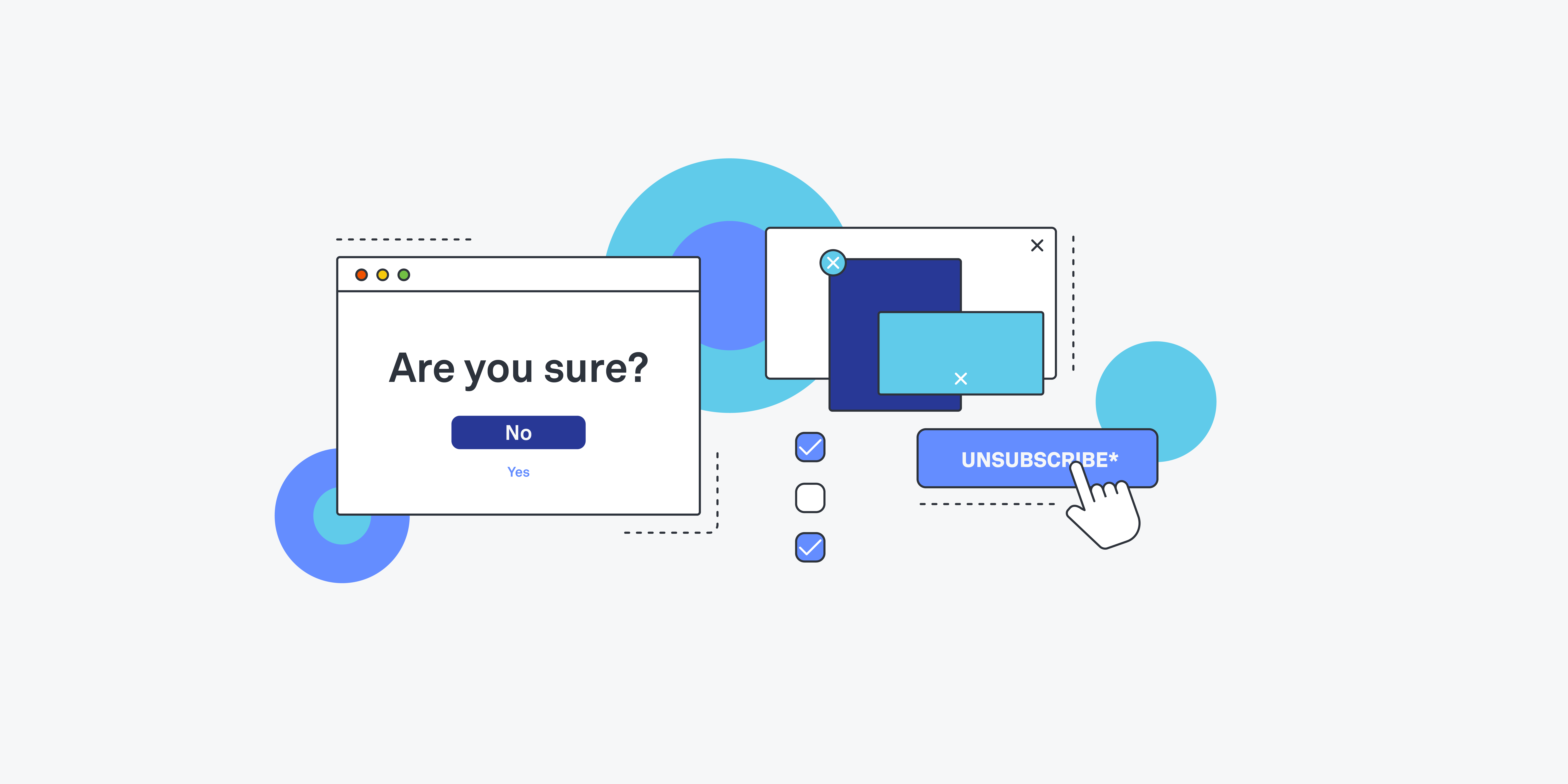
Not every pattern is beneficial. Dark patterns are deceptive UI tricks that nudge users toward unwanted actions—like sneaky extra fees at checkout. While they may produce short-term gains, they typically erode trust long-term. Pro Tip: Always opt for transparent interaction. Trust is everything in digital products. Lose it, and users rarely come back.
Best Practices with Real-Life UI Elements
From LinkedIn’s step-by-step onboarding to Amazon’s one-click checkout, the most successful UI design patterns minimize friction. They guide users toward completing tasks without confusion. Clarity, brevity, and consistency are your best friends. Whether creating a mobile UI pattern or web UI pattern, aim for an intuitive journey—one that enhances, rather than complicates, the experience.How Polymet Simplifies UI Patterns with AI
So, how does Polymet come into play? I used to waste hours coding variations of the same design components—forms, navbars, subscription pages, you name it. With Polymet, you can simply prompt the AI for a specific UI component.- Prompt-Based Generation: You describe the UI pattern—Polymet generates it.
- Edit part of the design: Don’t like the output? Send edit prompts to tweak the part of the design.
- Team Collaboration: Share your project links with stakeholders, get feedback, and refine instantly.
- Production-Ready Code: Once you settle on a design, you can export fully functional front-end code straight into your product.