Design System - Crafting Consistency and Efficiency
Have you ever visited a product’s website for the first time, only to find their mobile app or desktop platform looks and feels completely different? That sense of disconnect—where colors, fonts, and overall layouts clash—can leave you feeling disoriented and even doubtful about the brand’s reliability. I’ve seen this happen time and again with fast-growing startups, where everyone’s rushing to get features out the door, and design consistency falls through the cracks. After all, who has time to comb through countless Sketch files, Figma boards, or Slack messages just to figure out which button style you’re supposed to use? This is exactly where a design system comes into play. It gives us a single source of truth—a complete map of all the reusable components, visual tokens, and patterns that define a product’s experience. More importantly, it helps everyone on the team—from product owners and designers to developers—speak the same design language. When you think about well-known examples like the Carbon design system from IBM or Atlassian’s design system, it’s easier to see the value. They have neatly documented guidelines and component libraries that let every product or feature piggyback on a shared framework. That’s how you deliver a cohesive experience, even if your team is large and geographically scattered. But building a design system can be a huge undertaking. You have to identify every component your product needs, decide how they tie together, set up your token structure for colors and typography, and then ensure every single decision gets properly documented. That documentation matters because it’s the lifeblood of your system—without it, new hires and even experienced team members end up in guesswork mode. And guesswork is the enemy of both productivity and brand consistency. The good news is, you don’t have to do it all by hand anymore. With Polymet you can automate much of that manual grunt work and concentrate on the creative thinking that truly sets your brand apart. Polymet helps you generate components from prompts, tweak them in real time, and maintain a tidy library of everything you need. So as you scale, you can keep that polished, consistent feel no matter how many new pages or features you cram into your product. By the time you’ve put together a robust design system, not only will your users notice the difference, but your teams will also appreciate the clarity and speed it brings. Because the best design systems aren’t just about having cool-looking components—they’re about weaving an entire brand narrative into every pixel and ensuring that no matter where someone encounters your product, they recognize that it all comes from one place.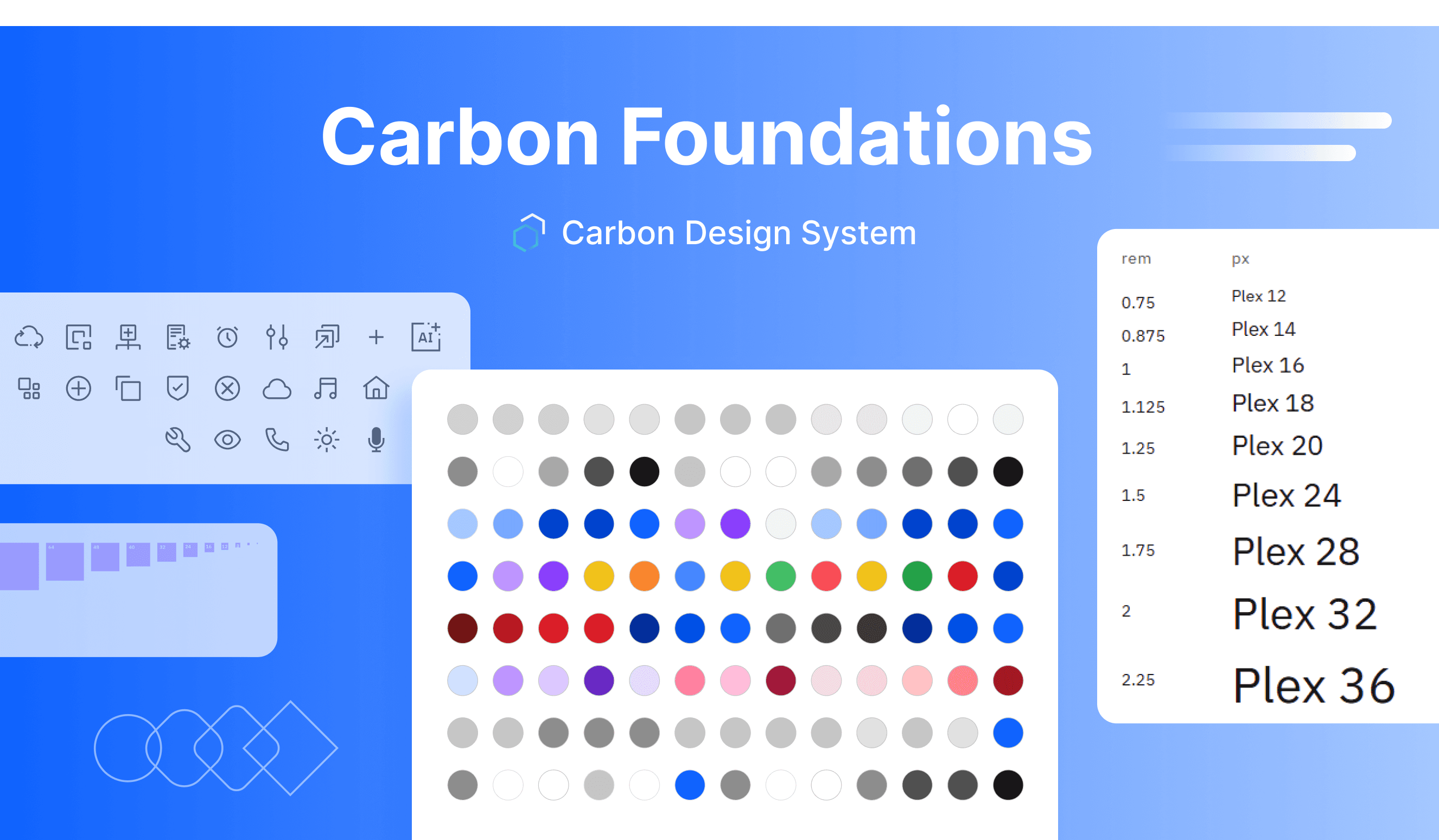 What is a design system?
A design system is a well-defined and structural collection of reusable design assets—components, tokens, guidelines—that keeps digital products visually cohesive and user-friendly. It eliminates guesswork, speeds up alignment, and ensures a team’s brand identity is clear and consistent in every release.
What is a design system?
A design system is a well-defined and structural collection of reusable design assets—components, tokens, guidelines—that keeps digital products visually cohesive and user-friendly. It eliminates guesswork, speeds up alignment, and ensures a team’s brand identity is clear and consistent in every release.
Design System Components
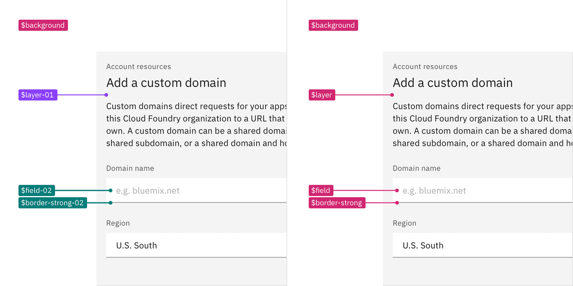
Picture your design system as a well-organized toolbox jam-packed with every nut, bolt, and gadget you need to build an interface. Instead of starting from scratch each time you design a new screen, you pick out the pieces you need—knowing they’ll fit together seamlessly. That means less time wrestling with inconsistent layouts and more time refining the user experience. These building blocks usually include: • Components: Think of them as ready-made UI elements—like buttons, forms, tabs, or cards—that reflect your brand’s personality. For instance, if your team has a signature color palette or specific corner radii, each component follows those so effortlessly that even new designers can drop them into place without rethinking styles each time. • Tokens: These are the raw ingredients of your design system, like color codes, font sizes, or spacing rules. Tokens unify products’ visual language under one cohesive style, turning the brand’s essence into a set of carefully chosen numbers, hex codes, and guidelines. A single change in a token—say, updating a primary color—ripples through every component, ensuring brand updates are applied instantly across all products.
 • Guides: Even the best components and tokens can create confusion if teams aren’t sure when or why to use them. That’s where written guides come in. They demonstrate the who, what, when, where, and why of your design elements. So if your typography tokens make headlines a distinct size, the guides explain when to use them, what their goal is, and how they might interact with other parts of the interface.
 • Styles: Beyond individual elements and tokens, your design system should capture the overall “feel” of your brand—things like animation choices, micro-interactions, and even tone of voice. These overarching themes connect different features or platforms under a single umbrella. Whether users are switching from a desktop app to a mobile site, styles ensure every touchpoint feels cohesive and familiar.
 Centralizing these components, tokens, guides, and styles in one place saves entire teams from guesswork and conflicting decisions. Because you’re offering a one-stop resource for everyone, from designers to developers, you drastically reduce the back-and-forth that can eat up countless hours. Instead, you’re free to focus on higher-level improvements, confident that your finished products will look and function like a tightly knit family of digital experiences.
Documentation
It’s one thing to piece together a set of UI elements, but documenting each piece can feel like a herculean task. I’ve personally seen design teams rattle off a polished set of buttons, color tokens, and layout rules, yet nobody knows exactly where to look when it’s time to update or review them. Without a single source of truth—clearly recorded and easy to interpret—everyone risks going off in their own direction. But why is documenting a design system so difficult? First, there’s the sheer amount of information to track. You have visuals, tokens, code snippets, usage guidelines, best practices, and more. For instance, your documentation might detail the difference between a primary and a secondary button, which color tokens are allowed, and how corners should be rounded. Multiply that across dozens of components, and you’ve got a logistical challenge. Then there’s the matter of keeping it current. If your team decides to change a type style or spacing scale, it’s easy for an outdated spec to stay hidden in a long-forgotten Figma file or Confluence page. Before you know it, half your developers are coding to old styles, and new designers don’t know which version to trust. Worse still, your users might see inconsistencies and wonder if something’s broken. Finally, explaining not just the “what” but also the “why” behind each design choice takes time and careful thought. Sure, you can list the individual tokens or components in a single page, but if nobody understands why those tokens matter—or where it’s appropriate to use them—you’re inviting confusion. That’s why well-organized documentation includes both the granular details and a sense of overarching philosophy. So yes, it’s tough. But it’s worth every ounce of effort. Clear, central documentation saves time down the line because new hires and even seasoned team members can get quick answers without searching through Slack threads or asking around for the “right” file. It also prevents guesswork, ensuring everyone is working with the same, correct set of rules. In many ways, thorough documentation is the backbone of a healthy, future-proof design system—because it keeps your design integrity intact, no matter how fast your product evolves.Maintenance
A design system isn’t something you can simply lock down once and move on. It’s more like a living organism: always growing, adapting, and sometimes even shedding features that no longer fit. As your product evolves, market conditions shift, and brand values change, the components you created a month ago could quickly become outdated. If you keep using those outdated parts, you wind up with inconsistencies that undermine your entire user experience. Much like any software, a design system needs scheduled check-ups and version updates. Think about how often your product roadmap changes—new features may require additional buttons, revised spacing rules, or updated color tokens. That means your system must accommodate them seamlessly. Without a clear update process, designers and developers might start bypassing the system. Over time, you’ll find half your team applying old specs, while the other half rushes ahead with unvetted new ones. This leads to a messy tangle of design debt that’s difficult to unravel. Regular maintenance also means assessing what’s actually being used and eliminating what isn’t. Stagnant or abandoned components only clutter up your library, causing confusion and slowing everyone down when they’re trying to find the right element. By pruning unused parts, you keep the system lean and relevant. The key is to set up a process—maybe monthly or quarterly—to review token changes, gather feedback from teams, and update documentation as needed. Everyone involved should know that a design system update might affect multiple products, so it’s crucial to communicate changes clearly. In the end, it’s an ongoing effort that, if done well, ensures your product stays aligned with both brand vision and user expectations.Design System Examples
IBM’s Carbon Design System
Often called the IBM design system, Carbon stands out for its meticulous documentation and carefully chosen tokens. Every piece—from color palettes to form behaviors—feels thoroughly considered, making it a benchmark for those aiming to build a scalable and polished design framework. You can check IBM’s Carbon Design System hereAtlassian Design System
Atlassian revolves around simplicity and clarity. Their system covers everything from product tone and voice to code implementation standards, ensuring a uniform brand presence. It’s a great model for teams looking to combine user-friendly guidelines with robust developer documentation. You can check Atlassian’s Carbon Design System hereUSWDS (U.S. Web Design System)
Open-source and government-focused, USWDS prioritizes accessibility and consistent user experiences across public sector websites. It’s a prime example of large-scale collaboration and a testament to why design systems matter for both visual cohesion and ease of use. You can check US Web Design System hereMaterial UI
Material UI takes Google’s Material Design guidelines and wraps them into a toolkit that developers can integrate right away. With a massive library of pre-built, ready-to-drop-in components, it’s often the first place teams look when they need a swift, polished design solution. Here is the MUIUber Design System
Uber’s approach focuses on scalability and brand cohesion across vastly different use cases—ranging from consumer apps to driver tools. They maintain a global design language that adapts to each product’s unique needs, showing how to evolve a design system in tandem with rapid business growth. Here is the Uber’s Design System Although each of these examples tackles unique business and user challenges, they all share one essential goal: unify product design across the board. By following consistent design system guidelines and reusable patterns, these systems enable teams to roll out new features quickly without sacrificing quality or brand integrity.How to create a new one - Design System Template
Ready to outline your own design system? Here’s a straightforward template to get started:- Introduction: State your design principles and brand mission.
- Visual Foundation: Define typography, color palettes, spacing, icons.
- Components: Build reusable parts (e.g., navbars, modals) and detail their variations.
- Guidelines: Note usage instructions, best practices, and do’s and don’ts for each component.
- Documentation: Keep it all accessible and easy to update.
- Versioning: Track changes, merges, and improvements.